

Cabinet Hardware for Beige Cabinets Is the Only Contrast You Get
Matching warm to warm is what makes beige hardware vanish. Find the undertone with a sheet of paper, then buy against it.

Cabinet hardware for beige cabinets has to supply the contrast, because very little else in a beige kitchen is going to. Brushed nickel is the default that survives the widest range of beiges, since it is the one metal that refuses to take sides on the undertone. If you want the room to look decided rather than safe, go to matte black instead. What moves the answer is what your beige is doing underneath the beige, and you can find that out in about a minute with a sheet of copier paper.
Shop the picks from this guide
In stock at Knobs.co · Free shipping on hardware orders $99+ · 110% price match
-
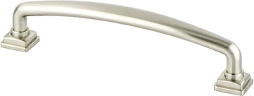 Berenson
Tailored Traditional 128mm CC Brushed Nickel Pull 1284-1BPN-P
Berenson
Tailored Traditional 128mm CC Brushed Nickel Pull 1284-1BPN-P
$10.93
$13.66 -
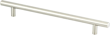 Berenson
Tempo 192mm CC Brushed Nickel Bar Pull 0806-2BPN-P
Berenson
Tempo 192mm CC Brushed Nickel Bar Pull 0806-2BPN-P
$11.53
$14.41 -
 Berenson
Bravo 56mm CC Brushed Nickel Edge Pull 1057-4BPN-P
Berenson
Bravo 56mm CC Brushed Nickel Edge Pull 1057-4BPN-P
$9.83
$12.28 -
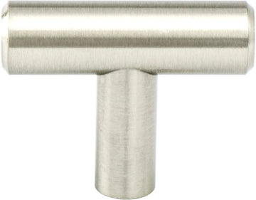 Berenson
Transitional Advantage Two Brushed Nickel T-Bar Knob 9435-2BPN-P
Berenson
Transitional Advantage Two Brushed Nickel T-Bar Knob 9435-2BPN-P
$2.80
$3.50 -
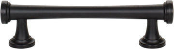 Atlas Homewares
Browning Pull 3 3/4'' ccMatte Black
Atlas Homewares
Browning Pull 3 3/4'' ccMatte Black
$14.50
$16.11 -
 Berenson
Folklore 3in. CC Brushed Nickel Cup Pull 8340-1BPN-P
Berenson
Folklore 3in. CC Brushed Nickel Cup Pull 8340-1BPN-P
$12.92
$16.15


Beige gives you a room with no punctuation in it
Most beige kitchens I get called into are the same value from floor to ceiling. Tan counter, cream backsplash, a wood floor in the same family, walls a shade off the doors. Nothing in the room is darker or lighter than anything else by much, and the eye slides across the whole thing without stopping. The hardware is the only element small enough to change cheaply and dark enough to register, which makes it the punctuation.
That is why the usual advice to match warm with warm goes wrong here. A warm gold on a warm beige of similar depth photographs well at arm's length and disappears from six feet away. I have watched people order a kitchen's worth of soft gold off a close-up photo and then ask me a month later why it looks like nothing was installed.
Your counter tells you how hard to push. If the counter is also in the beige family, tan granite, travertine, cream quartz, go further toward contrast than feels comfortable, because the room has no anchor at all. If the counter is a dark stone or a heavily veined one, the punctuation already exists and the hardware can afford to be quiet.
Find the undertone against a sheet of copier paper
Tape a sheet of plain white printer paper to a cabinet door in daylight. Beige has no color of its own to speak of, so it only declares itself next to a true white, and then it declares itself immediately: pink, yellow, green, or gray. Do it twice, once by the window and once on the wall furthest from it, because beige shifts more between those two spots than a saturated color ever would.
While the paper is up, compare a door beside the range to one at the far end of the run. Painted and finished surfaces yellow with heat and light, so the doors nearest the cooktop are usually half a step further along than the rest. I choose hardware against the yellower ones. They are where the kitchen is heading.
Pink beige
The most common beige in houses built from the late eighties onward, and the hardest to dress. Warm golds pull the pink forward until the doors read faintly salmon. Nickel goes the other way and makes the pink read as pink rather than as beige, which some people are relieved to see and others are not. The ones I rule out first all share that red: copper, rose-toned golds, and the warmer bronzes with visible copper highlights.
Yellow beige
The builder beige of a million kitchens. It takes a warm metal better than any other beige does, but warm on warm only works with distance in value, so an antique brass or a darkened bronze holds up where a bright gold sinks. Black is clean here too, with one caveat I will come back to.
Green beige
Often invisible until the paper goes up, then obvious. Anything with yellow in it makes the green unmistakable, so brass is the finish I steer people away from. Nickel and pewter sit quietly against it, and black is the safest strong move.
Greige
The gray-leaning beige, and the one with the most freedom, because the gray gives you a cool anchor to work against. This is the one beige where a warm metal genuinely earns its place: champagne bronze against greige gets its contrast from temperature instead of from depth, and the softness that would be a liability on a darker cabinet is the reason it works here. Polished chrome is the finish to avoid, since it reads cold and accidental beside a warm gray.
Brushed nickel is the right default, and it will not make the kitchen interesting
Brushed nickel reads as a warm silver rather than a blue-white one; the brushed grain takes the mirror out of the plating and leaves a soft, slightly yellow-leaning gray. That is the whole reason it carries all four undertones: it cools a beige door without turning it cold the way chrome does, and it has no yellow in it to wake up a green or a pink. Satin nickel is the same neighborhood with a finer, duller grain, and brands use the two names more or less interchangeably. On beige I take the duller one, because beige has no shine of its own to answer a bright metal with.
The cost is real: nickel on beige is invisible as a decision. Nobody walks into that kitchen and notices the hardware, which is exactly the point and exactly the limit. A plain beige kitchen with nickel hardware stays a plain beige kitchen. Narrow to two finishes and try a sample first; the cost is refunded with your full order, and finish names vary enough between makers that one company's satin nickel is another's brushed.
Matte black works, and it makes your beige look yellower
Matte black gives you the widest value gap available and it is the finish that makes a beige kitchen look chosen rather than inherited. Here is the part nobody mentions. Black raises the apparent saturation of whatever sits beside it, so a beige that was quietly yellow becomes noticeably yellow the day the hardware goes on. Against a pink beige that effect is a gift, because it pushes the pink toward a warm neutral. Against a yellow beige it can amplify the exact quality you were hoping to play down.
So on a yellow beige, put one black knob on one door and leave it up for a couple of days before ordering the kitchen. On the practical side, matte black is usually a powder coat or an e-coat. It hides fingerprints better than a gloss does, but it shows dust and cooking film, and in a beige kitchen that film is very nearly the color of the cabinets, so it turns up on the hardware and nowhere else.
The two combinations that put a date on a beige kitchen
Beige doors with mirror-polished brass and raised panels belongs to one decade, and beige doors with oil-rubbed bronze, a tumbled stone backsplash and brown granite belongs to the one after it. Neither finish is the culprit on its own. What dates the room is the whole set agreeing with itself, the same way it works on any other cabinet color.
If your kitchen already has the travertine or the tan granite, dark bronze doubles down on a look the room is already committing to, and a cool metal is the cheapest thing you can do to move it forward. I still specify oil-rubbed bronze on beige, but only where the floors are genuinely dark and the counter has real depth to it, so the bronze reads as part of a deliberate dark layer rather than as more brown.
When the cabinets are almond, not beige
A good share of people searching this are not designing anything. They have a laminate or thermofoil kitchen in a soft off-white, one plastic knob has snapped, and they want the same knob again. The word to search is almond, not beige. Almond came out of the appliance industry, where it was a standard finish alongside bisque and white, and it stayed as a hardware finish name long after the appliances moved on.
Matching it is harder than it sounds, because that plastic yellows with light and heat. A new knob from the same mold will be a shade cleaner than the ones that have been over your range for twenty years, so you are really choosing between replacing all of them or accepting an obvious odd one. The alternative is to stop matching. Those kitchens were almost always drilled at 3 in (76.2 mm) centers on the drawers, which is still a standard spacing, so any metal pull at that spacing drops into the holes you already have with nothing but a screwdriver. Knobs are a single hole and swap freely.
Are beige cabinet knobs worth matching?
Only if you can replace every one of them at once. Colored plastic and painted hardware drift with age and the doors drift with them, so a single new knob in the middle of a twenty-year-old run announces itself. If you are replacing the lot anyway, that is the moment to ask whether a metal finish would serve the kitchen better than another round of matching.
What replaces a 3 inch plastic handle pull in beige?
Anything at 3 in (76.2 mm) centers, which is one of the most common spacings there is, so the holes in your drawer fronts are not the constraint you might assume. A brushed nickel or matte black bar at that spacing installs in an afternoon. If you want to stay soft rather than go metal, look under almond and cream rather than beige, and buy enough for the whole kitchen in one order so the color is consistent.
Shop Brushed Nickel Cabinet Hardware
-
 Bradbury Pull 6 5/16'' cc
$16.57
Bradbury Pull 6 5/16'' cc
$16.57
-
 Crystal Legacy Square Knob 1 5/16''
$41.36
Crystal Legacy Square Knob 1 5/16''
$41.36
-
 Dot Knob 1 1/4''
$10.23
Dot Knob 1 1/4''
$10.23
-
 Dot Knob 2''
$14.63
Dot Knob 2''
$14.63
-
 Malin Pull 3 3/4'' cc
$13.64
Malin Pull 3 3/4'' cc
$13.64
-
 Malin Pull 6 5/16'' cc
$19.71
Malin Pull 6 5/16'' cc
$19.71
-
 Malin Pull 7 9/16'' cc
$23.63
Malin Pull 7 9/16'' cc
$23.63
-
 Sweetbriar Lane Pull 5 1/16'' cc
$18.27
Sweetbriar Lane Pull 5 1/16'' cc
$18.27


Browse all 1075 in Brushed Nickel Cabinet Hardware → Cabinet knobs Cabinet pulls & handles