


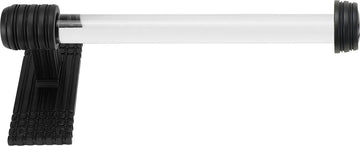


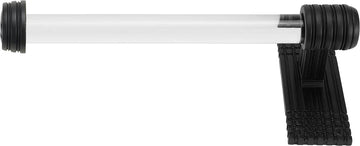
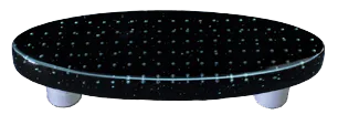
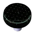
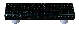
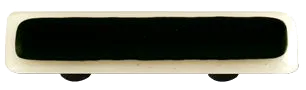


Black and white cabinet hardware: high-contrast two-tone pieces
Black and white cabinet hardware combines both colors on a single piece, usually as a black metal base with a white inset element or as alternating black and white sections on a multi-part pull. Common executions include ceramic or porcelain knobs with white tops on black metal bases, black metal pulls with white inlay detail, and patterned (striped, checkered, or graphic) knobs that play the two colors against each other.
What two-tone black and white reads as
The contrast is the point. Pure black against pure white produces the highest tonal contrast available in cabinet hardware, which means the piece reads from across a room and acts as a graphic element rather than a quiet finish. The trade-off is that high-contrast hardware does not recede; specifiers using it usually want the hardware to function as visible decoration, not as a service detail.
Where black and white works
Modern farmhouse, Parisian-bistro, scandi, monochrome modern, and graphic-traditional kitchens. It pairs cleanly with white shaker or flat-front cabinetry, marble counters with strong veining, black-framed windows, and high-contrast tile (checkerboard floors, subway with dark grout). The combination is especially effective in laundries, butler's pantries, and powder rooms, where the design budget for a graphic element is higher than in a primary kitchen.
How it compares to single-finish options
For buyers cross-shopping black and white against single-color finishes, the closest pure-finish alternatives are matte black on its own (high impact, single tone) and white on its own (quieter, cabinet-matching). The advantage of the combined finish is dimensional contrast on a single piece without needing a second metal in the mix. For more graphic patterned options outside the strict black-and-white range, see the colored finish category. Worth flagging for buyers ordering across a multi-piece installation: ceramic and porcelain executions of black and white hardware can vary slightly in glaze between pieces, especially on hand-painted or kiln-fired runs. That glaze variation is part of the character of hand-fired pieces and reads as deliberate craft, but specifiers planning a full kitchen run on glazed ceramic should expect the high-contrast pieces to read more variable than coated-metal hardware would.
What Customers Say
Trusted by thousands of designers, builders, and homeowners
Kayla Malo is the most attentive and super human ever! My experience with this company is stellar!
Love working with Kayla, she is extremely helpful and quick with responding to my questions!
Kayla was GREAT!!!! Super help and fast answers. One of the best I've ever dealt with.